The Custom Report Builder is SurveyMethods’ powerful drag-and-drop analysis tool that allows you to create custom professional reports that can be built before you have all of your survey results and updated with the latest results at the click of a button. This report includes our most powerful statistical analysis tools, such as cross-tabulations, statistical tables, etc.
We’ll discuss the Custom Report Builder in detail below, but if you prefer to view a video demo, you can view one here.
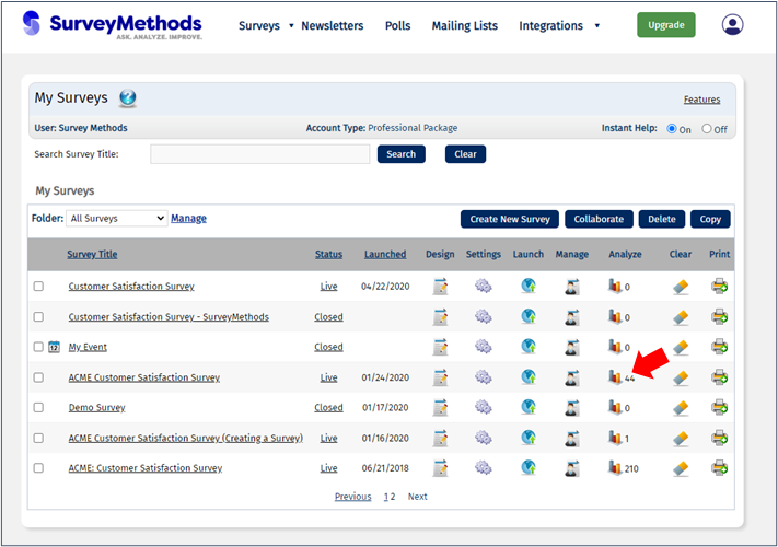
To use the Custom Report Builder, log in to your SurveyMethods account, find the survey you wish to analyze and click the Analyze icon () on that row.
On the Analyze Survey Results menu, look for the section titled “Professional Reports: Custom Report Builder” at the bottom of the page.

If you haven’t created any custom reports, this section will be empty. You can create a new report by clicking the Create Report button.
When you create a new report, you will be taken through a 5-step wizard to help you build your report:
- Choose between creating a new report from scratch or copying and modifying one of your existing reports, then enter a title for the report and click Continue.

- Set the default page layout and format, including setting margins, page orientation, heading and body font and size and paragraph spacing. You can also choose which elements you want included for each question you insert in the report.

Note that on this step you are just creating the template for the report. Any element you insert on this page will be inserted for each question you add to the report on the following step. For example, if you want to add a text explanation for the chart below each question, you can drag and drop the body element. The system will then insert a body (text) element below each chart that is added to the report, allowing you to add text later, when the report has been generated.
- Select the questions that you want included in the report initially (or insert all questions).

At the bottom of step 3, you can choose between “Continue to Create Segments” or you can skip straight to the report by clicking “Generate Report Without Segments”. Segments are sets of respondents that match your specified criteria. These can be based on responses to questions on your survey, on the date/time the response was completed, or based on custom field values. For example, if you have a question asking the gender of respondents, you can create a segment for men, a segment for women, and a segment for Other/Prefer not to respond. Then you can compare responses on other questions between these groups (such as whether women or men rated your products higher), which is known as cross-tabulation analysis.
Note that you will be able to choose which segments to add to a cross-tab chart, so you can create multiple unrelated segments to be displayed on different charts.
- If you choose Continue to Create Segments at the bottom of step 3 you will be taken to the create segments page, allowing you to build one or more segments from your data.
I’ve created four segments from my data:
- Men 35 years old and younger
- Women 35 years old and younger
- Respondents who completed the survey prior to March 2020
- Respondents who completed the survey in March 2020 or later

These segments will allow me to compare whether young men and young women view our products differently, and will also allow me to compare the impact of the coronavirus pandemic that began in the U.S. in March 2020 on our survey responses.
When I’m done with my segments, I can click Continue to go to step 5. Note that you will be able to edit your segments or create new ones even after your initial report is created so you don’t have to create them all now.
- The last step allows you to assign the segments you just created to question charts. This allows you to compare your segments to each other and to the overall responses. At this stage you can also insert one or more cross-tab charts or tables.

If you select more than one segment for a question, by default the report will insert one chart for each segment unless you also select either Cross-Tab Chart or Cross-Tab Table, which is specifying that you want the segments to be shown on the same chart or table.
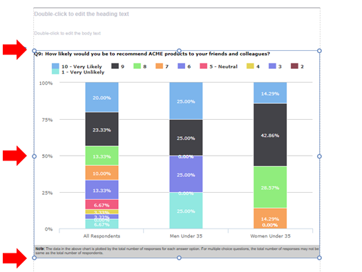
As you can see above, I left all of the questions as just the “All Respondents” category except on question 8, “what is your current household income?”, I want to see a cross-tab chart with the pre- and post-March 2020 data to see if household income of respondents has changed. I also added the men under 35 and women under 35 segments as a cross-tab chart for question 9, “how likely would you be to recommend ACME products to your friends or colleagues?”
When you’ve added the desired segments and charts/tables, click Generate Report. Depending on how many elements you have added to the report, it can take several minutes to generate the initial report.
When your report is ready, it will display in preview mode.
This is what the newly-generated report looks like, starting with Question 1, “What is your current age?”

This is what our Question 8 (household income) cross-tab chart looks like:

And here is the cross-tab chart comparing responses to the “how likely would you be to recommend Acme products” between men 35 and under and women 35 and under:

At this stage you can further customize the report. Some of the actions you can perform include the following:
- Enter text in any of the text boxes (header, footer, or any of the body elements that were inserted from the template)
- Customize the charts, including resizing, changing the chart type, changing the formatting (color scheme), hiding or displaying elements (segment names, question text, comments (where applicable), and data summary table)
- Insert elements, such as header or body text, or additional charts or tables
- Resize or move elements using drag and drop
- Export or share the report, make global formatting changes, add new segments, filter the report.
We’ll discuss each of these in further detail below.
Adding or Editing Text Boxes
You can add or edit text by double-clicking on any of the text elements.

Then simply type your desired text and click out of the element when you are done. While editing the element you will have various text formatting options available, such as changing the font, color or size, or making the text bold, italics, or underlined.

Customizing Chart Elements
When you hover over any chart element you will see various icons at the top right, which are used for customizing the chart.

: Show/Hide the segment name. By default the chart will show the segment name that is being displayed at the top left (in this case “All Respondents”). Clicking this icon will toggle the segment name as hidden or displayed on the chart. If you added more than one segment on step 5 of the wizard but did not choose a cross-tab chart or table, the report will include one chart for each segment you chose.
: Show/Hide the question text, in the screenshot above “Q1: What is your current age?”
: Show/Hide the comments. If a question contains an open-ended field (text box, numerical entry, comment box, “if other” option), this icon will allow you to display those comments below the chart.
: If there is not an open-ended option, the icon will be greyed out as there is nothing to display.
: Show/hide the data summary, which is the data in the grey bar below the chart.
: Additional chart options, including the ability to change the element type (chart or statistical table), change the segment that is displayed, change the chart type (horizontal bar, pie chart, scatter, etc), and edit the chart settings, e.g. changing the color scheme.
Inserting Elements
Across the top of the report you will see a list of elements available to be inserted into the report:

You can drag and drop these elements into the report to add them. Note that for certain elements (Charts, Bar Chart & Data Table, Statistical Measures, Question Text), you must first select the question in the dropdown at the top right and then drag the element onto the report.

Let’s say I want to add a cross-tab table below the question 9 cross-tab chart. I can first drag and drop the cross-tab element below the existing chart:

A dialog box will open allowing me to choose which questions or segments to display on the chart. For the x-axis we can choose to display responses to a specific question or we can display the segments. In this case, I want to display the same three segments as I have on the chart above, All Respondents, Men Under 35 and Women Under 35.
For the y-axis I will choose question 9 and then click Insert Cross-Tab Table.

The table will be added where the element was dropped:

Resize or Move Elements
You can resize elements by clicking on them to select, and then dragging the circles on the sides or corners to the desired size. Once you release, the chart will be resized and will adjust the widths and labels to better fit.

You can move elements by clicking them and dragging to the desired location in the report.
Report Menus
At the top left and top right of the report there are various menus and buttons to make global changes:

File
The File menu includes four possible actions:
- Save
- Export (as Word document)
- Change Report Title
- Exit (return to the survey application)
You can also Save or Exit using the buttons on the top right of the report.
Layout
The Layout menu includes the following sub-menus:
- Page Settings: adjust the global page settings, such as page size (letter, legal, A4, etc), margins, and orientation (portrait vs. landscape).
- Text Formatting: adjust the global text formatting options, such as heading and body font size, alignment, font color, etc.
- Paragraph Spacing: adjust the global setting for spacing between elements (default is 5 pixels above and below).
- Dashboard Page Settings: add or remove a dashboard page to your report, which displays the general survey statistics, such as survey status, response statistics, and points summary, if there are any points questions in the survey.
- Question Number Visibility Settings: toggle on or off the question number display throughout the report.
Export
The Export menu allows you to export your report to a Word document, where you can then make further customizations.
Data Settings
The Data Settings menu has two sub-menus:
- Data Elements: this sub-menu has further sub-menus that allow you to adjust the global chart and table formatting options. For example, if you want to hide the segment name on all charts, you can choose Data Settings > Data Elements > Global Settings > Segment Name, and then choose Hide Segment Name. You can also change the default formatting for all charts of a certain type. For example, you can change the color scheme for all vertical bar charts at the same time. When making global chart changes, you have an option to change all charts, or to only change charts that have not been formatted individually.
- Data Filters: this sub-menu allows you to further filter your data. You can filter by complete or partial responses only, or you can create custom filters based on responses to certain questions, the date/time a response was submitted, or custom field values. This allows you to easily build a single report and then generate the same report for different segments, such as regions, departments, etc.
Segments
The Segments menu allows you to edit the segments you previously created or create new segments. You can then add segments to existing charts or insert new charts by dropping the chart element into the report and choosing the new segment(s).
Exit
When you’re done with your report, you can click the Exit button to be returned to the Reporting menu in the application. Your new report will remain available in the Custom Report Builder section.
Running Your Report with Updated Data
As you receive additional responses or when you’ve closed your survey, you will want to return to your custom report and re-generate it to make further edits or to export it. You can return to the Reporting menu and you will see your saved report in the Custom Report Builder section. Clicking the Edit icon will run the customized report with the latest response data.

You can then edit the report using the tools discussed above, or export it to Word to make additional customizations and edits or convert the report to PDF to be distributed.
Who Can Use This Feature?
The Custom Report Builder is available to SurveyMethods Professional and Enterprise users.